Visualizing Japan's Population Data using D3.js, Flask and MongoDB
Summary. In this project an interactive data visualisation is created using a dataset containing Japan's population between 1871 and 2015. The data is broken down by geographic region in a number of ways, including by island, prefecture, region and capital.
Skills used:
- Programming (Python: Flask for web server. Numpy and Pandas libraries for data manipulation. Javascript: D3.js, DC.js and crossfilter.js for visualisations. keen.io Javascript and css libraries for visualisation layout).
- Databases (MongoDB).
Introduction
This project is based on that which Adil Moujahid created [1]. However, it is modified in the following ways:
- the dataset used is completely different.
- the layout used for the visualisation is changed.
- different graphs and interactive elements are used.
Dataset
The dataset [2] used for this project details Japan's population between 1872 and 2015. It was chosen for two main reasons:- it contains geographic information.
- it contains time series data.
Some basic cleaning was done:
- remove prefecture string '-ken' to enable the dataset to be used with the geojson.
- convert population to integer and fill missing values with 0.
- add population density variable.
df['prefecture'] = df['prefecture'].str.replace("-ken", '')
df.population = df.population.fillna(0).astype(int)
df['pop_density'] = df['population']/df['estimated_area']
df['pop_density'] = df['pop_density'].round(1)
Using MongoDB to store the data
MongoDB [4] was used to store the data in a non-relational database. Non-relational databases have the following advantages:
- they don't require the data schema to be declared in advance (i.e. they are schema-less). This means they offer flexibility by being able to store data in different formats.
- they scale very well.
Setting up MongoDB
After installation, on linux the mongodb service (mongod) is started with
sudo service mongod start
To check that the mongod process has started successfully the contents of the log file at /var/log/mongodb/mongod.log can be checked; in particular the line '[initandlisten] waiting for connections on port 27017'. The status of the service can be checked/ modified subsequently with the following:
sudo service mongod stop

sudo service mongod restart

service mongod status
Loading the database
MongoDB supports importing databases in both csv and json format. To load the database from the csv
mongoimport --db DATABASE_NAME --collection COLLECTION_NAME --type csv --file 'PATH_TO_CSV/FILENAME.csv' --headerline
In order to make sure the database is loaded correctly use:
Mongo

show dbs

use DATABASE_NAME

show collections

db.getCollection("COLLECTION_NAME").findOne()

db.getCollection("COLLECTION_NAME").findOne({}, {VARIABLE_1:1, VARIABLE_2:1, VARIABLE_3:1, VARIABLE_4:1, _id:0})
where VARIABLE_1 etc are the variables defined in the data. The above can also be used to make queries to the database from the command line.
Using PyMongo to interact with the database from within Python
from pymongo import MongoClient

#Specify string names inside '' for following variables
MONGODB_HOST = 'localhost'
DBS_NAME = 'DATABASE_NAME'
COLLECTION_NAME = 'COLLECTION_NAME'
#Specify numerical variable (default used)
MONGODB_PORT = 27017

#Specify variables in csv of interest
FIELDS = {'prefecture': True, 'year': True, 'population': True, 'capital': True, 'region': True,'estimated_area': True,'island': True,'pop_density': True, '_id': False}
Using Flask to run the webserver
Flask [5] is used to create a webserver that retrieves the data from the database as it is requested by the rendered html page containing the visualisation. In particular the Python flask application looks for an index.html file inside the templates directory, and serves this at the specified port of http://localhost:5000/.
from flask import Flask
from flask import render_template

app = Flask(__name__)

@app.route("/")
def index():
    return render_template("index.html")

if __name__ == "__main__":
    app.run(host='0.0.0.0',port=5000,debug=True)
In order to check that the database is accessible, the following can used:
@app.route("visualisation/testing")
def visualisation_testing():
    connection = MongoClient(MONGODB_HOST, MONGODB_PORT)
    collection = connection[DBS_NAME][COLLECTION_NAME]
    input_variables = collection.find(projection=FIELDS)

    json_variables = []
    for v in input_variables:
        json_variables.append(v)
    json_variables = json.dumps(json_variables, default=json_util.default)
    connection.close()
    return json_variables
which utilizes the information supplied previously to output the specified variables defined by FIELDS to http://localhost:5000/visualisation/testing.
Creating a new visualization layout based on keen.io
Keen.io [6] produces templates for visualisations. The template used by [1] was modified to create a new layout. This was done by modifying the index.html file which Flask serves. Each element of the visualisation has an entry like the following:
<!-- population vs population density-->
          <div class="col-sm-12">
            <div class="chart-wrapper">
              <div class="chart-title">
                Population vs population density as function of capital
              </div>
              <div class="chart-stage">
                <div id="bubble-chart"></div>
              </div>
            </div>
          </div>
          <!-- population vs population density -->
The individual elements are arranged into rows using a div tag of class 'row' and into columns depending on how many graphs/info elements are put on the same row. This way a grid of elements split into rows and columns can be created.
Creating the data visualizations with D3.js
The index.html file contains links to the css style file, Bootstrap Keen.io dependancy and also to the javascript libraries used for charting namely
The graphs and information elements themselves are designed within the graphs.js file (also linked in the index.html file) and called individually from the index.html file by div id tags. For example, the bubble chart is referenced with
<div id="bubble-chart"></div>
In the graph.js file it is constructed using
var populationBubbleChart = dc.bubbleChart('#bubble-chart');
The graphs.js file first uses the queue.js libraries .defer method to read both the dataset and geojson files simultaneously. The .await function is used to delay starting the construction of the charts (defined within the function makeGraphs) until all the data has been read. The makeGraphs function takes the input data sources as input. It performs the following steps:
- defines a crossfilter instance.
- creates the crossfilter dimensions based on the input variables.
- creates the crossfilter groups based on the dimensions. For the bubble chart a running tally is maintained so that the chart is updated as filters are applied/removed.
- defines the charts.
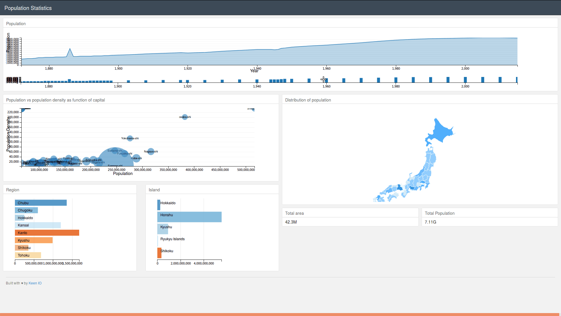
- population vs year chart zoomable with smaller version underneath
- bubble chart showing population density vs population by capital
- population by region
- population by island
- Japan map divided into prefectures, showing population of those selected
- number showing total area selected
- number showing total population selected
- builds the charts by passing the required parameters.
- displays charts using the dc renderAll() function.
Figure 1: gif animation of visualisation.
Bibliography
- A. Moujahid. Interactive Data Visualization with D3.js, DC.js, Python, and MongoDB., http://adilmoujahid.com, 2015.
- J. Derenski. Japan Population Data: Japan's Population Over Time, and Space., Japan, 2018.
- M. Wichary. Japan geojson., Japan, 2013.
- M. Inc. MongoDB for GIANT Ideas., MongoDB, 2009.
- A. Ronacher. Flask: web development, one drop at a time., A Python Microframework., 2010.
- A. Kasprowicz. Keen: Analytics for Developers., keen.io, 2015.
- M. Bostock. D3 for Data-Driven Documents., IEEE Trans. Visualization & Comp. Graphics (Proc. InfoVis), 2011.
- dc. dc.js - Dimensional Charting Javascript Library., dc, 2009.
- M. Bostock. Crossfilter: Fast Multidimensional Filtering for Coordinated Views., crossfilter, 2011.
- M. Bostock. d3-queue - Evaluate asynchronous tasks with configurable concurrency., dc, 2011.